Cards
摘自 Google material design 文档
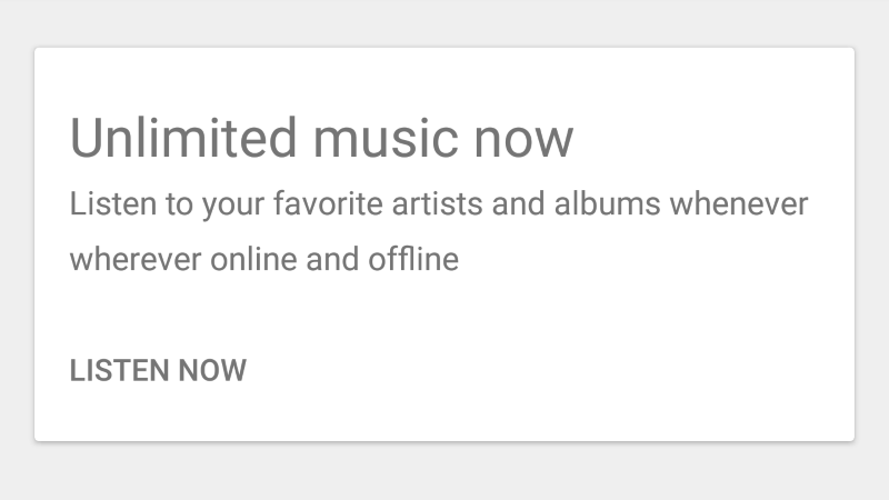
card 可以用来展示一些独特相关的数据,用来作为更加详细的信息的入口。例如,卡片可能包含有照片,文字,关于一个主题的链接等。
如何添加?
I. 在 build.gradle 里引入 cardview 库。
dependencies {
  compile 'com.android.support:cardview-v7:X.X.X' // where X.X.X version
}
II. 在 layout.xml 里声明 card ,并用它包裹其他的 view 。
<android.support.v7.widget.CardView
    android:layout_width="match_parent"
    android:layout_height="200dp">

    <TextView
        android:text="Hello World!"
        android:layout_width="wrap_content"
        android:layout_height="wrap_content"/>

</android.support.v7.widget.CardView>
注意
给 CardView 的父布局增加属性 android:clipToPadding="false" ,可以保证 CardView 的阴影不被裁剪掉。
如何设置样式?
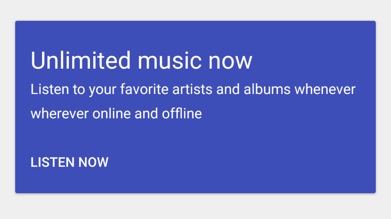
I. 在 styles.xml 文件里声明你自定义的样式。
<style name="MyCardViewStyle" parent="Theme.AppCompat.Light">
    <item name="cardCornerRadius">2dp</item>
    <item name="cardElevation">2dp</item>
    <item name="contentPaddingBottom">24dp</item>
    <item name="contentPaddingTop">24dp</item>
    <item name="contentPaddingLeft">16dp</item>
    <item name="contentPaddingRight">16dp</item>
    <item name="cardBackgroundColor">@color/indigo</item>
</style>
II. 设置你的 CardView 的 style 属性值为自定义的样式。
<android.support.v7.widget.CardView
    android:layout_width="match_parent"
    android:layout_height="wrap_content"
    style="@style/MyCardViewStyle">
翻译水平有限,欢迎批评指正
原文链接 https://materialdoc.com/components/cards/