Navigation drawer
From Google material design documentation and android training.
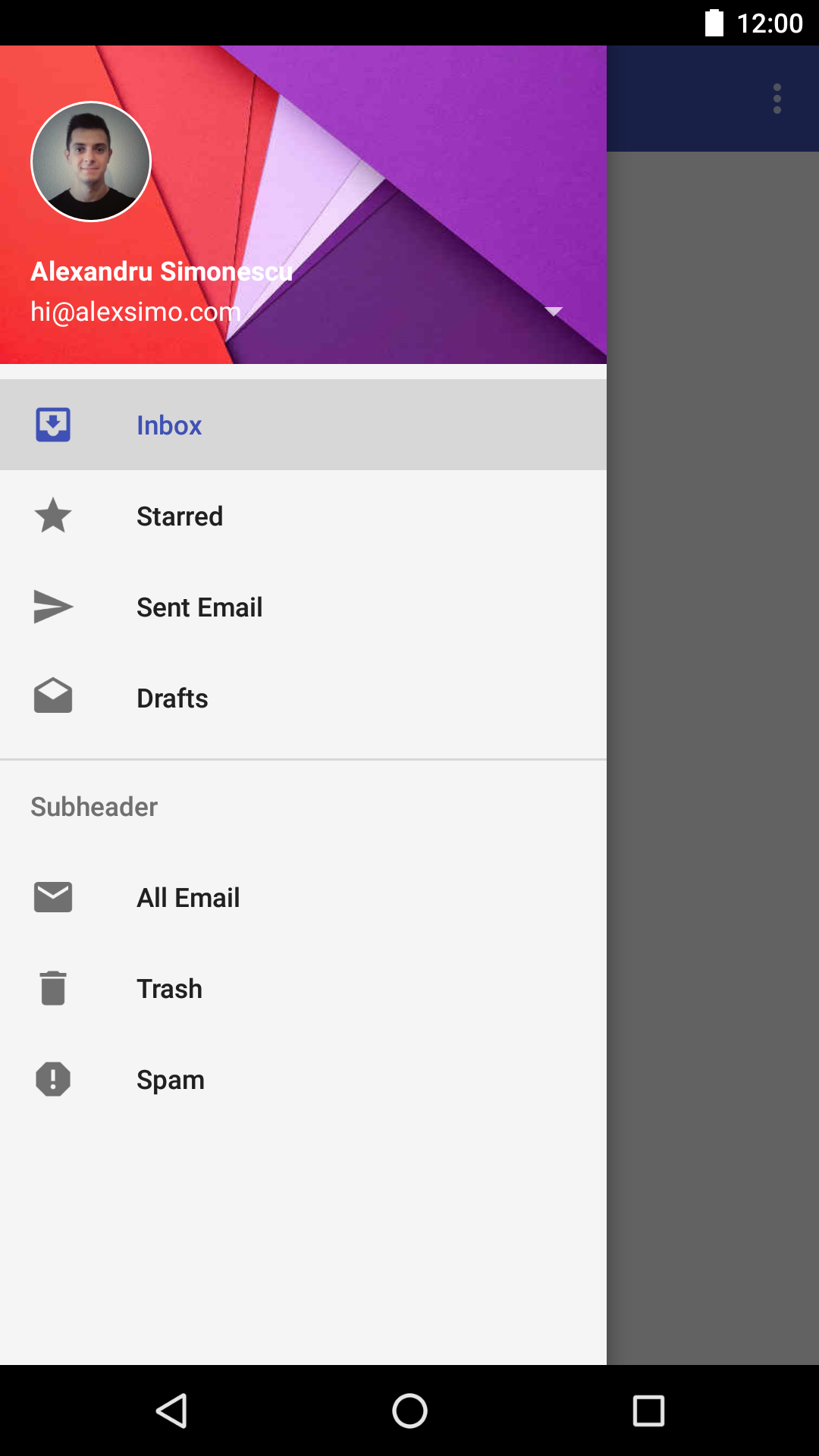
The navigation drawer slides in from the left. It is a common pattern found in Google apps and follows the keylines and metrics for lists.
Normally represents the app’s main navigation options on the left edge of the screen. It is hidden most of the time, but is revealed when the user swipes a finger from the left edge of the screen or, while at the top level of the app, the user touches the app icon in the toolbar.
How to add?
I. In your build.gradle file add the latest appcompat, design and support-v4 libraries.
compile 'com.android.support:appcompat-v7:X.X.X'
compile 'com.android.support:design:X.X.X'
compile 'com.android.support:support-v4:X.X.X'
// X.X.X specify the version
II. Declare DrawerLayout as your root layout container, inside you will have two views, one containing your main layout and another containing drawer items.
<android.support.v4.widget.DrawerLayout
    xmlns:android="http://schemas.android.com/apk/res/android"
    xmlns:app="http://schemas.android.com/apk/res-auto"
    android:id="@+id/drawer_layout"
    android:layout_width="match_parent"
    android:layout_height="match_parent"
    android:fitsSystemWindows="true">

  <include layout="@layout/content_main"/>

  <android.support.design.widget.NavigationView
      android:id="@+id/nav_view"
      android:layout_width="wrap_content"
      android:layout_height="match_parent"
      android:layout_gravity="start"
      android:fitsSystemWindows="true"
      app:headerLayout="@layout/drawer_header"
      app:menu="@menu/drawer_menu"/>

</android.support.v4.widget.DrawerLayout>
In above example, @layout/content_main contains your main content and NavigationView drawers items.
III. Create the menu file in your values folder values/menu.xml.
<?xml version="1.0" encoding="utf-8"?>
<menu xmlns:android="http://schemas.android.com/apk/res/android">
  <group android:checkableBehavior="single">
    <item
        android:id="@+id/nav_inbox"
        android:checked="true"
        android:icon="@drawable/ic_inbox_grey600_36dp"
        android:title="@string/inbox"/>
    <item
        android:id="@+id/nav_starred"
        android:icon="@drawable/ic_star_grey600_36dp"
        android:title="@string/starred"/>
    <!-- more items -->

    <item
        android:id="@+id/subheader"
        android:title="@string/subheader">
      <menu>
        <item
            android:id="@+id/nav_all_email"
            android:icon="@drawable/ic_email_grey600_36dp"
            android:title="@string/all_email"/>
        <!-- more items -->
      </menu>
    </item>
  </group>
</menu>
The menu structure is hierarchical, that let's you separate your items in categories.
IV. To add a header for your drawer, create a layout file in layout/drawer_header.xml.
<LinearLayout xmlns:android="http://schemas.android.com/apk/res/android"
    xmlns:app="http://schemas.android.com/apk/res-auto"
    android:layout_width="match_parent"
    android:layout_height="@dimen/drawer_header_height"
    android:gravity="bottom"
    android:background="@drawable/navigation_background"
    android:orientation="vertical"
    android:padding="@dimen/activity_horizontal_margin"
    android:theme="@style/ThemeOverlay.AppCompat.Dark">

  <ImageView
      android:id="@+id/drawer_profile_image"
      android:layout_width="@dimen/drawer_header_profile"
      android:layout_height="@dimen/drawer_header_profile"
      android:layout_marginBottom="@dimen/standard_margin"
      android:scaleType="centerCrop"
      android:src="@drawable/alexandru_simonescu"
 />

  <TextView
      android:id="@+id/name"
      android:layout_width="match_parent"
      android:layout_height="wrap_content"
      android:text="Alexandru Simonescu"
      android:textAppearance="@style/TextAppearance.AppCompat.Body1"
      android:textStyle="bold"
      />

  <TextView
      android:id="@+id/email"
      android:layout_width="match_parent"
      android:layout_height="wrap_content"
      android:text="hi@alexsimo.com"
      android:textAppearance="@style/TextAppearance.AppCompat.Body1"
      style="@style/Widget.AppCompat.Spinner"
      />

</LinearLayout>
V. In your activity find the NavigationView and NavigationDrawer and set their listeners.
Drawer setup.
private void setupDrawer() {
    drawerLayout = (DrawerLayout) findViewById(R.id.drawer_layout);
    drawerLayout.setDrawerListener(new DrawerLayout.DrawerListener() {
      @Override public void onDrawerSlide(View drawerView, float slideOffset) {

      }

      @Override public void onDrawerOpened(View drawerView) {

      }

      @Override public void onDrawerClosed(View drawerView) {

      }

      @Override public void onDrawerStateChanged(int newState) {

      }
    });
  }
Note
To achieve the round image effect you can use Google's official way.
Example using Google's RoundedBitmapDrawable:
Bitmap bitmap = BitmapFactory.decodeResource(getResources(), R.drawable.avatar);

RoundedBitmapDrawable rounded =   RoundedBitmapDrawableFactory.create(getResources(), avatar);

rounded.setCornerRadius(bitmap.getWidth());

ImageView drawerProfile = (ImageView) drawerLayout.findViewById(R.id.drawer_profile_image);
drawerProfile.setImageDrawable(rounded);
NavigationView setup.
public void setupDrawerContent(NavigationView navigationView) {
    navigationView.setNavigationItemSelectedListener(
        new NavigationView.OnNavigationItemSelectedListener() {
          @Override
          public boolean onNavigationItemSelected(MenuItem item) {
            item.setChecked(true);
            // manage menu item click
            drawerLayout.closeDrawers();
            return true;
          }
        });
  }
VI. If needed you can give some basic styling using the properties:
android:background="@color/colorDrawer"
app:itemBackground="@color/colorDrawerItem"
The drawables colors should be selector defining for each pressed state - focused, checked, active, etc.
Menu item background.
<?xml version="1.0" encoding="utf-8"?>
<selector xmlns:android="http://schemas.android.com/apk/res/android">
  <item android:drawable="@drawable/button_pressed"
      android:state_pressed="true"/>
  <item android:drawable="@drawable/button_focused"
      android:state_focused="true"/>
  <item android:drawable="@drawable/button_focused"
      android:state_hovered="true"/>
  <item android:drawable="@drawable/button_normal"/>
</selector>