Text fields
Text Fields
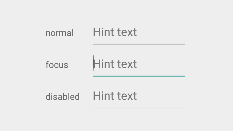
摘自 google material design 文档
Text fields 允许用户输入文本,选择文本(剪切,复制,粘贴),通过自动补全检索查询数据。
如何添加?
I. 在你的 build.grade 文件末尾添加 appcompat 库。
android.support.v7.app.AppCompatActivity。
III. 在任意的 layout.xml 文件内声明你的 EditText 。
<EditText
    android:layout_width="match_parent"
    android:layout_height="wrap_content"
    android:hint="Hint text" />
如何设置样式?
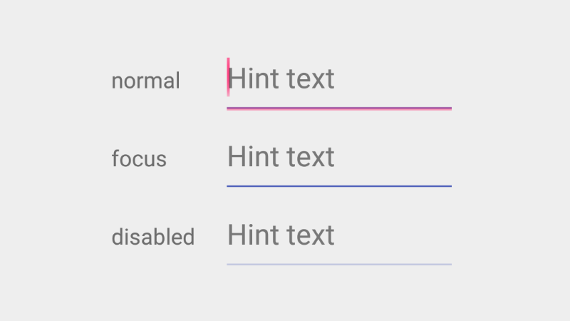
I. 在你的 styles.xml 文件内声明自定义样式。
<style name="MyEditText" parent="Theme.AppCompat.Light">
    <item name="colorControlNormal">@color/indigo</item>
    <item name="colorControlActivated">@color/pink</item>
</style>
EditText 声明里设置 android:theme 的属性值为你自定义的样式。
<EditText
    android:layout_width="match_parent"
    android:layout_height="wrap_content"
    android:hint="Hint text"
    android:theme="@style/MyEditText" />
Single-line text field
摘自 google material design 文档
Single-line text fields,当输入光标到达输入框右边缘时,文本框的内容会自动滚动到左边。
要让你的 EditText 为单行,需要添加 android:singleLine 属性,并且设置其值为 true 。
<EditText
    android:layout_width="match_parent"
    android:layout_height="wrap_content"
    android:singleLine="true"
    android:hint="Hint text" />
Multi-line text field
摘自 google material design 文档
Multi-line text fields,当光标达到输入框边缘时,文本框会为溢出的文字自动增加一行,以使文本可以垂直滚动。
要让你的 EditText 为多行,需要添加 android:inputType 属性,并且设置其值为 textMultiLine 。
<EditText
    android:layout_width="match_parent"
    android:layout_height="wrap_content"
    android:inputType="textMultiLine"
    android:hint="Hint text" />
Full-width text field
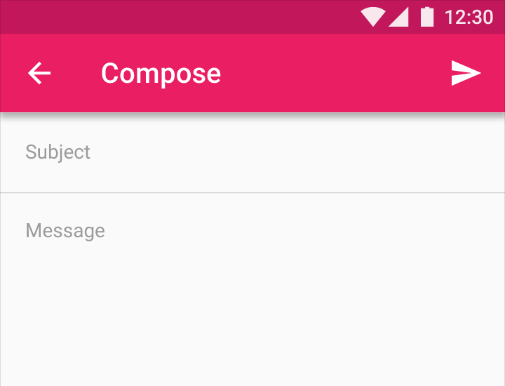
摘自 google material design 文档
Full-width text fields(和父布局等宽)适用于更深入复杂的工作。
I. 在你的 styles.xml 中声明你自定义的样式。
<style name="FullWidthEditText" parent="Widget.AppCompat.EditText">
    <item name="android:padding">20dp</item>
    <item name="android:background">@null</item>
    <item name="android:textSize">@dimen/abc_text_size_subhead_material</item>
</style>
II. 在你的 EditText 声明里设置 style 属性值为你自定义的样式。
<EditText
    style="@style/FullWidthEditText"
    android:layout_width="match_parent"
    android:layout_height="wrap_content"
    android:hint="Subject" />
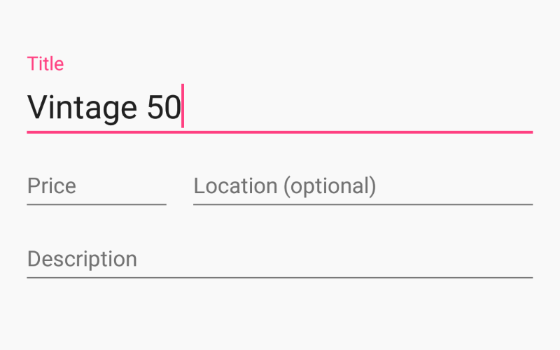
Floating labels
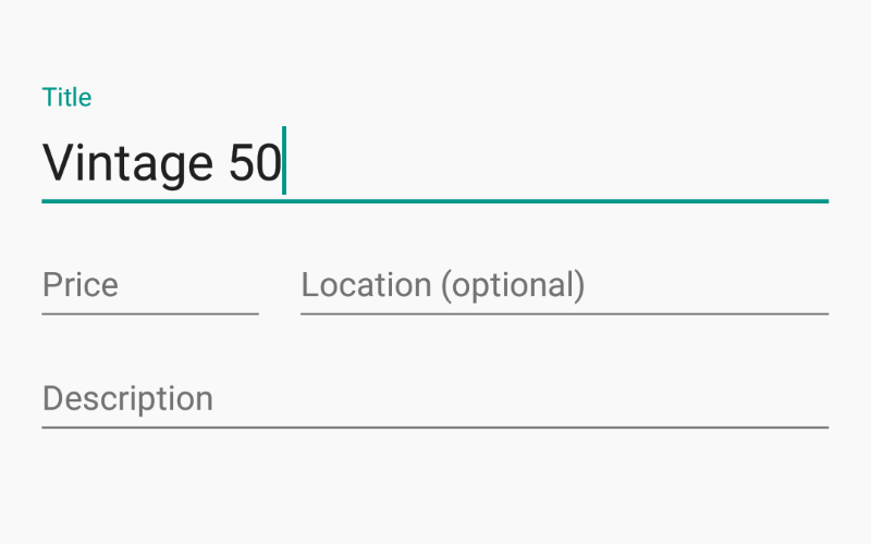
摘自 google material design 文档
当用户在输入框输入字符时,行内的浮动标签会自动移动,浮动在输入框的上方。
如何添加?
I. 在你的 build.gradle 文件里添加最新版本的 appcompat 和 design 库。
dependencies {
    compile 'com.android.support:appcompat-v7:X.X.X' // where X.X.X version
    compile 'com.android.support:design:X.X.X' // where X.X.X version
}
II. 让你的 activity 继承 android.support.v7.app.AppCompatActivity 。
III. 在任意的 layout.xml 里声明你的 EditText ,并用 TextInputLayout 包裹。
<android.support.design.widget.TextInputLayout
    android:layout_width="match_parent"
    android:layout_height="wrap_content">

    <EditText
        android:layout_width="match_parent"
        android:layout_height="wrap_content"
        android:hint="@string/Title" />

</android.support.design.widget.TextInputLayout>
备注
控件 TextInputLayout 和 EditText 都具有 android:hint 属性,你可以使用它们中的任意一个。
如何设置样式?
I. 在你的 styles.xml 里声明你自定义的样式。
<!--Floating label text style-->
<style name="MyHintText" parent="TextAppearance.AppCompat.Small">
    <item name="android:textColor">@color/pink</item>
</style>

<!--Input field style-->
<style name="MyEditText" parent="Theme.AppCompat.Light">
    <item name="colorControlNormal">@color/indigo</item>
    <item name="colorControlActivated">@color/pink</item>
</style>
II. 设置上面定义的样式给你的 TextInputLayout 的 app:hintTextAppearance 属性 和 EditText 的 android:theme 属性。
<android.support.design.widget.TextInputLayout
    android:layout_width="match_parent"
    android:layout_height="wrap_content"
    app:hintTextAppearance="@style/MyHintText">

    <EditText
        android:layout_width="match_parent"
        android:layout_height="wrap_content"
        android:hint="@string/Title"
        android:theme="@style/MyEditText" />

</android.support.design.widget.TextInputLayout>
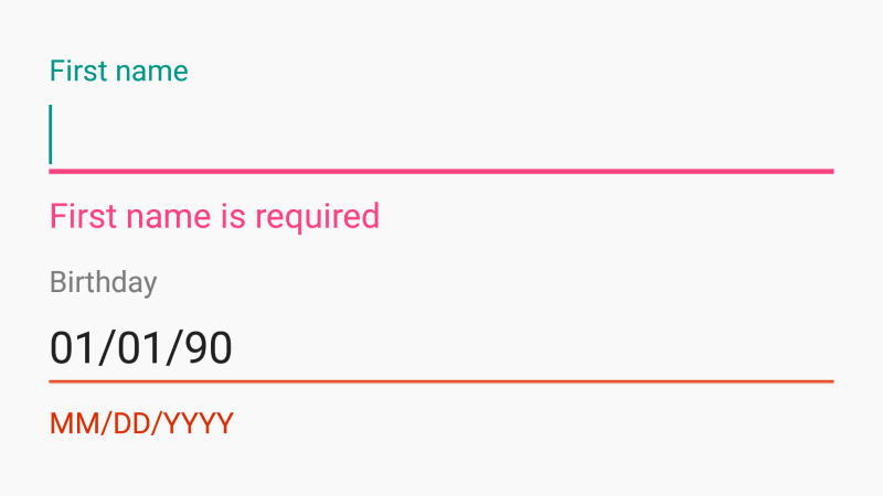
User input errors
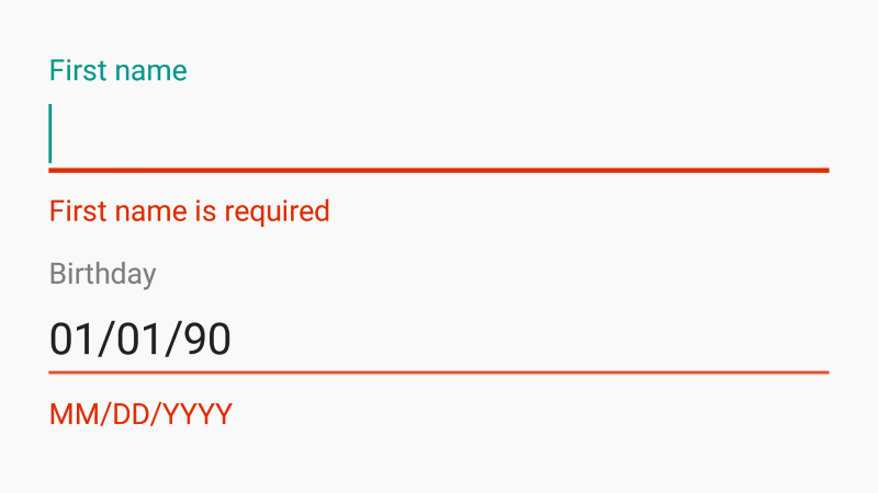
摘自 google material design 文档
(添加了这个属性)一旦检测到输入错误,就会帮助用户去解决它。如果检测到输入错误,就禁止提交表单;(或者)如果提交表单之后检测到错误,可以清楚地解释错误并提示如何去解决。
如何添加?
I. 在你的 build.gradle 文件里添加最新版本的 appcompat 和 design 库。
dependencies {
    compile 'com.android.support:appcompat-v7:X.X.X' // where X.X.X version
    compile 'com.android.support:design:X.X.X' // where X.X.X version
}
II. 让你的 activity 继承自 android.support.v7.app.AppCompatActivity 。
III. 在任意的 layout.xml 声明你的 EditText ,并用 TextInputLayout 包裹它。
<android.support.design.widget.TextInputLayout
    android:id="@+id/inputLayout"
    android:layout_width="match_parent"
    android:layout_height="wrap_content"
    app:errorEnabled="true">

    <EditText
        android:layout_width="match_parent"
        android:layout_height="wrap_content"
        android:hint="@string/First_name" />

</android.support.design.widget.TextInputLayout>
IV. 要展示或者隐藏 error 需要用到 TextInputLayout 的 setError 方法。
TextInputLayout inputLayout = (TextInputLayout) findViewById(R.id.inputLayout);
inputLayout.setError("First name is required"); // show error
inputLayout.setError(null); // hide error
备注
在 TextInputLayout 里声明 app:errorEnabled="true" 属性需要在 EditText 下面给错误提示标签预留空间。
如何设置样式?
I. 在 styles.xml 声明你自定义样式。
<!--Error label text style-->
<style name="MyErrorText" parent="TextAppearance.AppCompat.Small">
    <item name="android:textColor">@color/pink</item>
</style>

<!--Input field style-->
<style name="MyEditText" parent="Theme.AppCompat.Light">
    <item name="colorControlNormal">@color/indigo</item>
    <item name="colorControlActivated">@color/pink</item>
</style>
II. 设置上面定义的样式给你的 TextInputLayout 的 app:errorTextAppearance 属性 和 EditText 的 android:theme 属性。
<android.support.design.widget.TextInputLayout
    android:layout_width="match_parent"
    android:layout_height="wrap_content"
    app:errorTextAppearance="@style/MyHintText"
    app:errorEnabled="true">

    <EditText
        android:layout_width="match_parent"
        android:layout_height="wrap_content"
        android:hint="@string/Title"
        android:theme="@style/MyEditText" />

</android.support.design.widget.TextInputLayout>
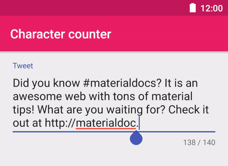
Character counter
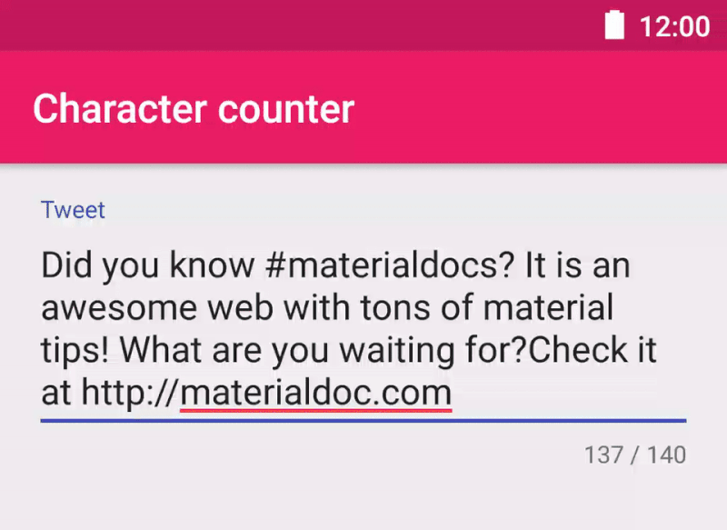
From google material design documentation.
Use a character counter in fields where a character restriction is in place.
How to add?
I. In your build.gradle add latest appcompat and design libraries.
dependencies {
    compile 'com.android.support:appcompat-v7:X.X.X' // where X.X.X version
    compile 'com.android.support:design:X.X.X' // where X.X.X version
}
II. Make your activity extend android.support.v7.app.AppCompatActivity.
III. Declare your EditText inside any layout.xml file and wrap it with TextInputLayout. Add app:counterEnabled attribute and set its value to true. To restrict maximum characters count set some integer value to app:counterMaxLength attribute.
<android.support.design.widget.TextInputLayout
        android:id="@+id/inputLayout"
        android:layout_width="match_parent"
        android:layout_height="wrap_content"
        app:counterEnabled="true"
        app:counterMaxLength="140">

    <EditText
        android:layout_width="match_parent"
        android:layout_height="wrap_content"
        android:hint="hint text" />

</android.support.design.widget.TextInputLayout>
How to style?
 To define a custom style for the overflow.
I. Define the text style.
<!--Overflow label text style-->
<style name="MyOverflowText" parent="TextAppearance.AppCompat.Small">
    <item name="android:textColor">@color/deep_orange</item>
</style>
II. Apply this styles to your TextInputLayout via app:counterOverflowTextAppearance attribute.
Password toggle
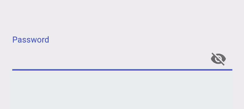
From google material design documentation.
When the visibility icon is displayed with a text field, it indicates whether or not that field’s input is visible. A text field’s visibility may be toggled on or off using the icon.
How to add?
I. In your build.gradle add latest appcompat and design libraries.
dependencies {
    compile 'com.android.support:appcompat-v7:X.X.X' // where X.X.X version
    compile 'com.android.support:design:X.X.X' // where X.X.X version
}
II. Make your activity extend android.support.v7.app.AppCompatActivity.
III. Declare your EditText inside any layout.xml file and wrat it with TextInputLayout. Add app:passwordToggleEnabled and set its value to true.
<android.support.design.widget.TextInputLayout
        android:id="@+id/inputLayout"
        android:layout_width="match_parent"
        android:layout_height="wrap_content"
        app:passwordToggleEnabled="true">

    <EditText
        android:layout_width="match_parent"
        android:layout_height="wrap_content"
        android:hint="Password" />

</android.support.design.widget.TextInputLayout>
Note
Declare app:passwordToggleContentDescription attribute inside TextInputLayout for accessibility purposes.
How to style?
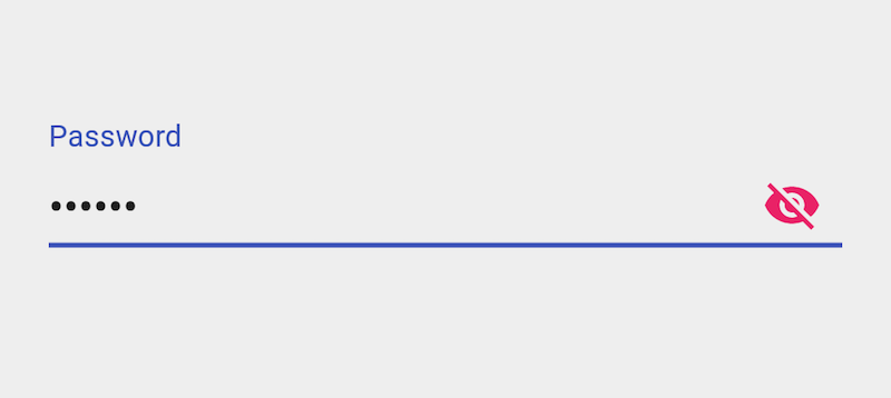
To change the color of the password toggle icon, use the app:passwordToggleTint attribute:
<android.support.design.widget.TextInputLayout
        android:id="@+id/inputLayout"
        android:layout_width="match_parent"
        android:layout_height="wrap_content"
        app:passwordToggleEnabled="true"
        app:passwordToggleTint="@color/colorAccent">

    <EditText
        android:layout_width="match_parent"
        android:layout_height="wrap_content"
        android:hint="Password" />

</android.support.design.widget.TextInputLayout>
Moreover, you can specify the blending mode with the app:passwordToggleTintMode attribute.
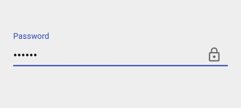
Icon
To change the password toggle icon, use the app:passwordToggleDrawable attribute:
<android.support.design.widget.TextInputLayout
        android:id="@+id/inputLayout"
        android:layout_width="match_parent"
        android:layout_height="wrap_content"
        app:passwordToggleEnabled="true"
        app:passwordToggleDrawable="@drawable/ic_lock">

    <EditText
        android:layout_width="match_parent"
        android:layout_height="wrap_content"
        android:hint="Password" />

</android.support.design.widget.TextInputLayout>
Use a StateListDrawable with the android:state_checked attribute to use separate drawables for each toggle state. Moreover, choose an AnimatedStateListDrawable to animate the drawables between states.
翻译水平有限,欢迎批评指正
原文作者: Volodymyr Yatsykiv 原文链接: Text Fields