Notifications
Notifications with text
摘自 Google material design 文档
在您的应用程序里,使用 Notifications 告知你的 APP 用户一些相关和及时的信息。很多场景下,你都可以创建 notifications 来吸引注意,如朋友发来信息,交通状况不好的时候提醒通勤状况,安装应用完成的时候展示一个进度条等。
Notifications should be synced to all of a user’s devices.
如何添加?
I. 在你的 build.gradle 文件里添加最新的 appcompat 库。
II. 获取一个 NotificationCompat.Builder 实例。
III. 使用 Notification.Builder 创建一个 Notification 。
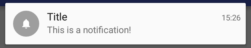
Notification notification = builder
    .setContentTitle("Title")
    .setContentText("This is a notification!")
.setSmallIcon(R.drawable.ic_notifications_white_small)
    .build();
IV. 使用 NotificationManagerCompat 的 notify 方法展示你设置了 id 的那个 Notification 。
NotificationManagerCompat notificationManager =
    NotificationManagerCompat.from(context);

notificationManager.notify(0x1234, notification);
备注
为了显示通知,标题、文字、小图标是强制性必须要设置的。
如何设置样式?

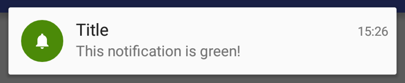
在你的 notification 里使用 NotificationCompat.Builder 的 setColor(int color) 方法给圆形背景设置颜色。
Notification notification =
    new NotificationCompat.Builder(context)
        .setContentTitle("Title")
        .setContentText("This is a notification!")
        .setSmallIcon(R.drawable.ic_bell)
        .setColor(Color.parseColor("#4B8A08"))
        .build();
包含图片的通知
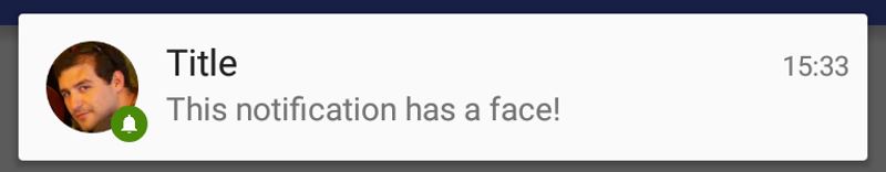
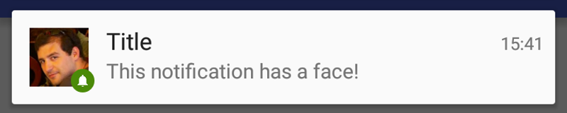
使用 NotificationCompat.Builder 的 setLargeIcon(Bitmap) 方法给通知的设置小图标旁边的大图标。
Notification notification =
    new NotificationCompat.Builder(context)
        .setContentTitle("Title")
        .setContentText("This is a notification!")
        .setSmallIcon(R.drawable.ic_bell)
        .setLargeIcon(profileImageBitmap) // Bitmap
        .setColor(Color.parseColor("#4B8A08"))
        .build();
振动通知
使用 NotificationCompat.Builder 的 setVibrate 方法设置一个带有振动模式的通知。
long[] vibratePattern = new long[] {
   millisToWait, millisToVibrate,
   millisToWait, millisToVibrate
}

Notification notification =
    new NotificationCompat.Builder(context)
        .setContentTitle("Title")
        .setContentText("This is a notification!")
        .setSmallIcon(R.drawable.ic_bell)
        .setVibrate(vibratePattern)
        .build();
备注
为了能够使用振动,你需要在 AndroidManifest.xml 里声明 android.permission.VIBRATE 权限。
带呼吸灯的通知
使用 NotificationCompat.Builder 的 setLights(int argb, int msOn, int msOff) 方法定制设备要显示的呼吸灯的颜色和 LED 模式。
Notification notification =
   new NotificationCompat.Builder(context)
      .setContentTitle("Title")
      .setContentText("This is a notification!")
      .setSmallIcon(R.drawable.ic_bell)
      .setLights(Color.MAGENTA, onMillis, offMillis)
      .build();
技巧和最佳实践
I. 专门针对时间敏感的用户进行通知。
II. 对于另外一个人发的通知,要包含他的图片。
III. 当用户点击一个通知的时候,允许用户直接进行操作。这可能会打一个详情视图,如一条信息,或者多个通知的摘要视图。
IV. 当没有使用 setLargeIcon 方法,而使用了 setSmallIcon 方法,默认情况下,使用圆形图片。当使用了 setLargeIcon 方法时,要用圆形图片时则要手动设置。
Warning
原文作者:Saúl Díaz González 翻译:Ailurus
Expanded Notifications Layouts
Quote
From the Google Material Design documentation_
You can choose how much detail your app's notifications should provide. They can show the first few lines of a message or show a larger image preview.
The additional information provides the user with more context, and—in some cases—may allow the user to read a message in its entirety.
How to use it?
I. Add the latest version of appcompat library on your build.gradle.
II. Retrieve an instance of NotificationCompat.Builder.
III. Apply a style to the NotificationCompat.Builder
IV. You have several styles available.
// Big Text Style
NotificationCompat.BigTextStyle style
    = new NotificationCompat.BigTextStyle(builder);
// Big Picture Style
NotificationCompat.BigPictureStyle style
    = new NotificationCompat.BigPictureStyle(builder);
V. Build a Notification using the NotificationCompat.Builder
Notification notification = builder
    .setContentTitle("Title")
    .setContentText("This is a notification!")
    .setSmallIcon(R.drawable.ic_notifications_white_small)
    .build();
VI. Pass along the Notification object via notify method from NotificationManagerCompat and assign an ID of your choice.
NotificationManagerCompat notificationManager =
    NotificationManagerCompat.from(context);

notificationManager.notify(0x1234, notification);
Note
Title, text and small icon are mandatory so the notification can be displayed.
Big Text Style
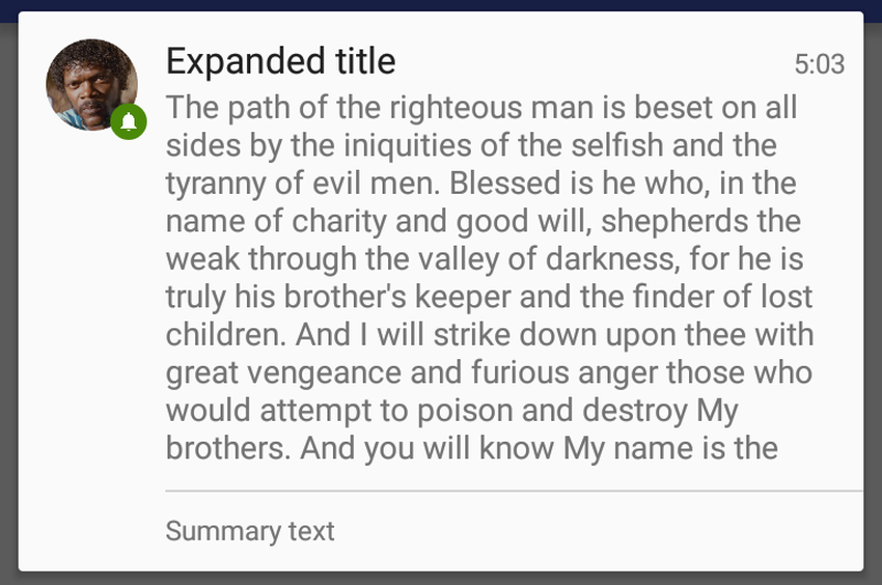
Big Text Style is used to show large quantities of text. The notification body can hold around 450 characters. The rest of the text will be trimmed without the use of an ellipsis.
I. Apply the style by passing the builder to a NotificationCompat.BigTextStyle
instance.
II. Set the long text you want to display on the expanded mode.
Note
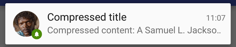
For the compressed layout, the text set via setContentText of NotificationCompat.Builder will be shown.
III. Use the method setBigContentTitle of NotificationCompat.BigTextStyle if you want a different title for the expanded layout form.
Note
If you do not call this method the title will fallback to the value you set on setContentTitle from NotificationCompat.Builder.
IV. Add if you like an additional summary to the expanded layout form.
style.bigText("The path of..." /* long text goes here */ )
     .setBigContentTitle("Expanded title")
     .setSummaryText("Summary text");
Big Picture Style
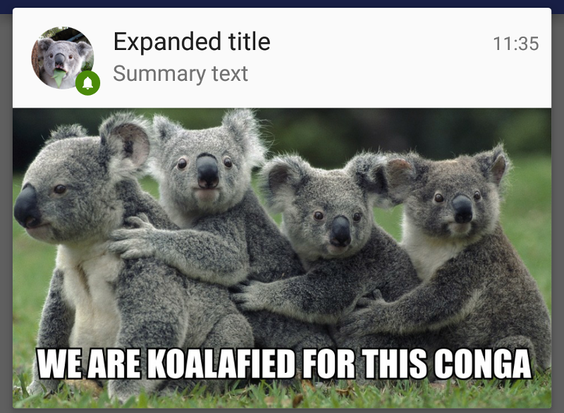
Note
Big Picture Style is used to show image-rich content. The image limits will be phone screen length by 256dp height. On Tablets, the image is 2:1 ratio. The rest of the image will be cropped with a ScaleType.CROP_CENTER.
I. Create a new instance of NotificationCompat.BigPictureStyle which will accept a NotificationCompat.Builder instance.
Note
Check how NotificationCompat.Builder are managed on the basic notifications article.
II. Add the image you want to display by using BigPictureStyle.bigPicture method. The format of the image must be a Bitmap.
Bitmap picture = BitmapFactory.decodeResource(getResources(), R.drawable.conga);
style.bigPicture(picture);
III. Add a new LargeIcon if you want to change it. In other case it will default to NotificationCompat.Builder.setLargeIcon(Bitmap).
Bitmap largeExpandedAvatar = BitmapFactory.decodeResource(
             getResources(), R.drawable.koala_avatar)

style.bigPicture(picture)
     .bigLargeIcon(largeExpandedAvatar);
IV. Add a new title for the expanded layout form.
Bitmap picture = BitmapFactory.decodeResource(getResources(), R.drawable.conga);
Bitmap largeExpandedAvatar = BitmapFactory.decodeResource(
             getResources(), R.drawable.koala_avatar)

style.bigPicture(picture)
     .bigLargeIcon(largeExpandedAvatar);
     .setBigContentTitle("Expanded title")
V. Add a summary which sums up the notification content.
Bitmap picture = BitmapFactory.decodeResource(getResources(), R.drawable.conga);
Bitmap largeExpandedAvatar = BitmapFactory.decodeResource(
             getResources(), R.drawable.koala_avatar)

style.bigPicture(picture)
     .bigLargeIcon(largeExpandedAvatar);
     .setBigContentTitle("Expanded title")
     .setSummaryText("Summary text");
Inbox Style
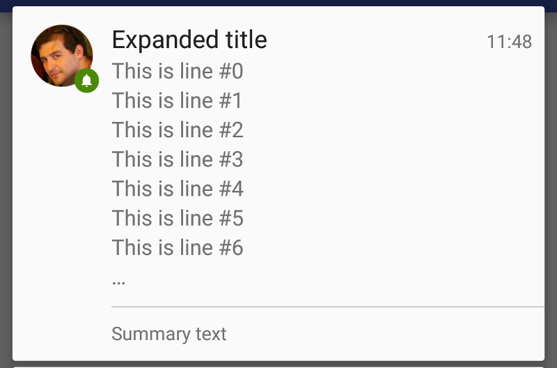
Quote
Inbox Style allows a notification made of several independent lines of short text, as in the normal notifications. This style accepts up to 7 lines. Any number above the notification will ellipsize further lines by adding a "...".
I. Apply the style by creating a new NotificationCompat.BigPictureStyle instance.
II. Add as many lines as you wish.
III. Add a different title if you want by usingsetBigContentTitle.
IV. Optionally add a summary to the notification.
style.addLine("This is line #" + i)
    .setBigContentTitle("Expanded title")
    .setSummaryText("Summary text");
Tricks and good practices
I. Guidelines insist that every app should display a single notification at all times in order to keep the notification list clean. Use InboxStyle to join several notifications in one while providing a history of the last ones.
II. Expanded layouts will be automatically displayed when the notification list have enough space, while compressing them otherwise. Play with different titles, LargeIcon and summaries to pick the interest of your user in both cases. If your notification is related to an image content, make it more attractive by using BigPictureStyle.
III. If your notification does not require images and there is only one, using by default BigTextStyle will not hurt. In this way, you will ensure that you can accomodate as much text as possible and giving the user the maximum context available.